A Case Against Material Design
21 min read time
29 May 2022
Material Design can be helpful for business and development, but sometimes not so much for user experience.
The idea of "front-end" can sometimes be divided into two facets of development: front-of-front-end and back-of-front-end. Back-of-front-end concerns itself with how a user interface interacts programmatically with the underlying system, while front-of-front-end concerns itself with how a user interface is composed.
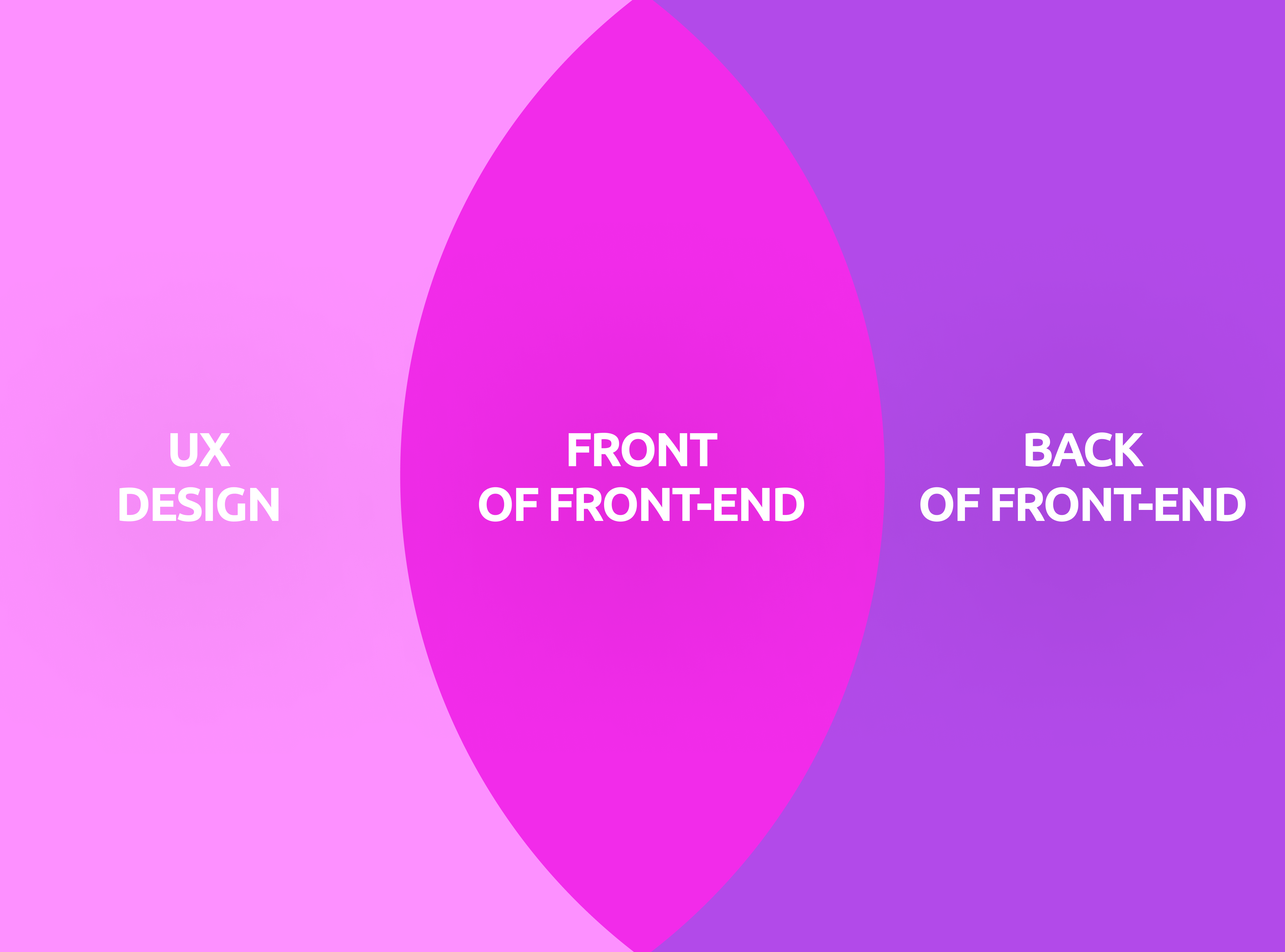
Front-of-front end is where UX designers and front-end developers often have significant cross-over, but UX is unfortunately rarely taken into consideration when decisions are made on how the front-end should fundamentally be structured. Because of this, UX designers often come into organizations where tech stacks have already been chosen - including which design language that an organization should abide by.
One popular design language that is often picked by technical teams is Google's Material Design system. It comes with its own library of UI components called Material UI. It's a popular choice because it's easy to develop for, creates predictability, is available for most front-end platforms and is a well-known technology with a large talent pool to recruit from. It's often presented internally as a "quality of life"-type improvement to the code base, and is usually implemented as-is - out of the box. In other words, it emplowers technical organizations to work fast and to deliver towards commercial goals.
People might assume that Material Design is also beneficial for designers - especially since the system comes from a prominent organization like Google - but it's important to remember that an organization being large or financially successful doesn't mean that they're an authority in every field that they dabble in. Google has historically been an engineering-first organization with a history of making unusual- and unconventional design choices, and Material Design is no exception to this.
Identifying UX challenges in Material Design
Material Design was originally designed to emulate the idea of working with paper in a physical space, which expresses itself in that the design system tends to look arts and crafts-inspired. Stacked paper is a core concept in Material Design, which is achieved by piling flat surfaces on top of each other and having them cast dropshadows. Because of this, products built using Material Design tend to be flat, single-colored and have little visual distinction between sections.
These design patterns were not chosen because they were rooted in user experience principles, they were chosen as a creative art direction. Rather than basing the principles of the design system on best practices, heuristics and research, they were seemingly based on a creative concept. As a result of this, Material Design has suffered from several significant design issues - some of which are prevalent to this day.
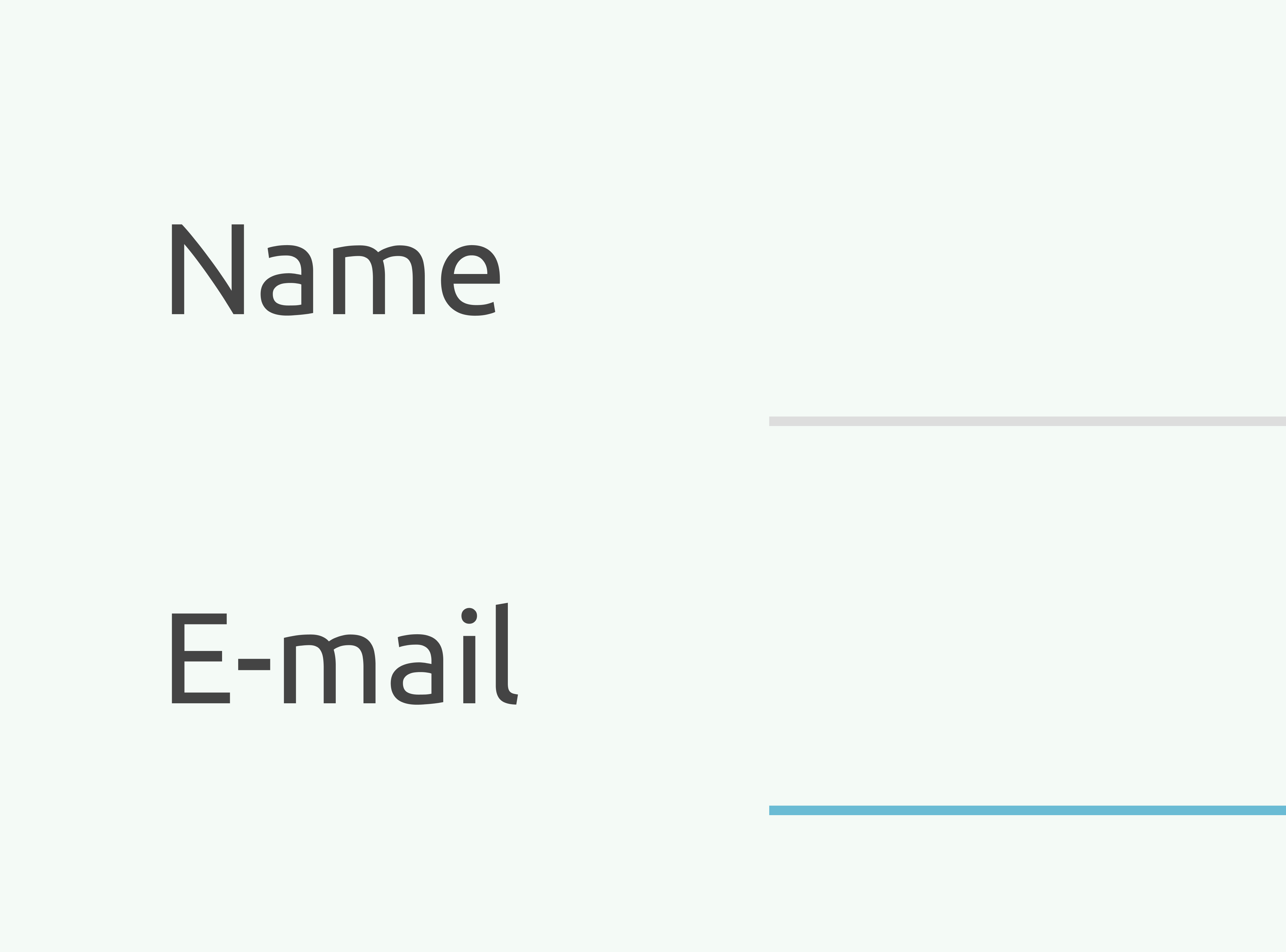
An example of unorthodox design choices in Material Design are the text fields that were present in the system when it was first launched. Historically, text input fields have always been represented by a bordered rectangle. This has been a well-recognized convention since the '80s, which is why it was surprising when Google decided to represent text input fields as a single straight line.
Not only does this violate Jakob's Law (following established UX conventions) and not only was this input field design indistinguishable from a horizontal rule (i.e. a single-line border), but it took Google three years and a user research experiment to come to this realization. The issue could've been avoided had they merely decided to follow best practices from the beginning.
Another challenge is Material Design's insistance on maintaining a paper-inspired interface. Even after several iterations, applications built with Material Design tend to have a flat and cluttered composition. When surfaces and sections fail to guide the user's eyes towards content in a sensible way, users are likely to perceive views as confusing.
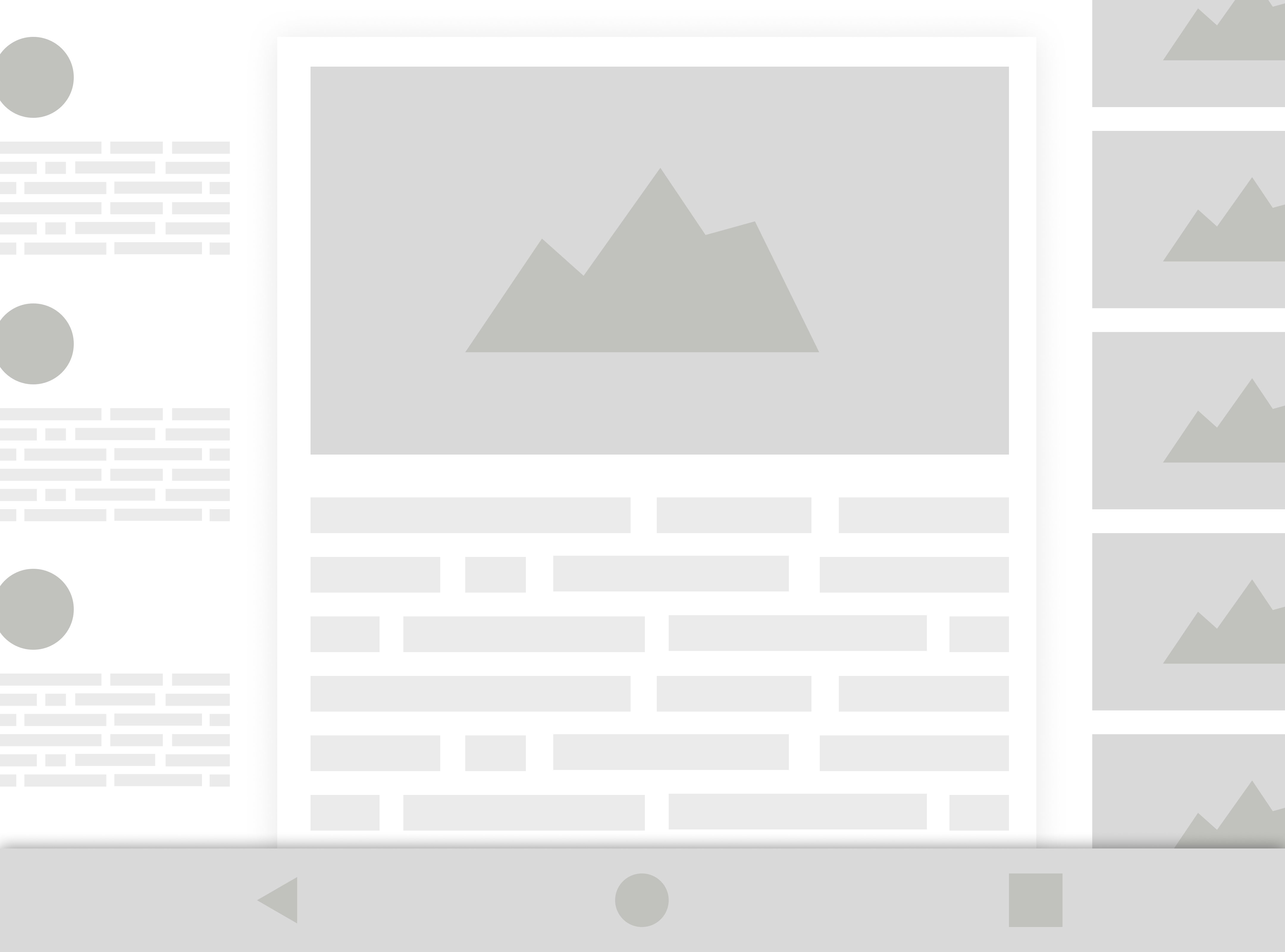
With no visual hierarchy and with so many elements vying for the user's attention, the user's cognitive load is going to significantly increase. This is again a matter of creative direction over UX.
Similar to the issues with layouts, color composition also poses its own set of challenges. When it comes to colors, Material Design has a system that generates tones and variations based on a set of base colors. This means that instead of designers controlling the color scheme, developers will let Material Design generate colors for any user interface components.
Unfortunately these colors are often poor as far as accessibility goes, with bright and low-saturated colors on top of white backdrops. These color compositions tend to fail accessiblity tests, and can also be challenging for the average user in terms of clarity.
In addition, since these color schemes aren't based on an organization's brand colors they're likely to be inconsistent with the organization's visual identity. A color scheme that is based on the internal logic of Material Design is going to deviate from whatever design language that an organization is otherwise using internally.
A proposed solution to this issue is using Material Design's so-called "theme" concept. However, themes require their own logic for skinning Material Design components and usually involve working agains the fundamental logic for how Material Design has constructed its visual elements. The result of this is that developers often end up fighting with Material Design to implement a design vision that doesn't gel with the fundamentals of how the design system works.
Eventually the approach of building a custom Material Design theme often falls to the side in favor of more important commercial priorities, and the organization will likely stick with a low-quality amalgamation of the internal designers' requests and the default visual direction that Material Design comes with out of the box.
Ideally color schemes should be based on human reasoning and research, not a system that dictates a palette based on a generative mathematical system. Especially when those generated palettes have accessibility- and contrast issues.
Another example of how developers sometimes end up struggling with Material Design is when working with dynamic units. Dynamic units have been around for a long time. In web browsers units like "em" and "rem" have been supported for almost a decade now, and dynamic units for native iOS- and Android applications were introduced soon thereafter.
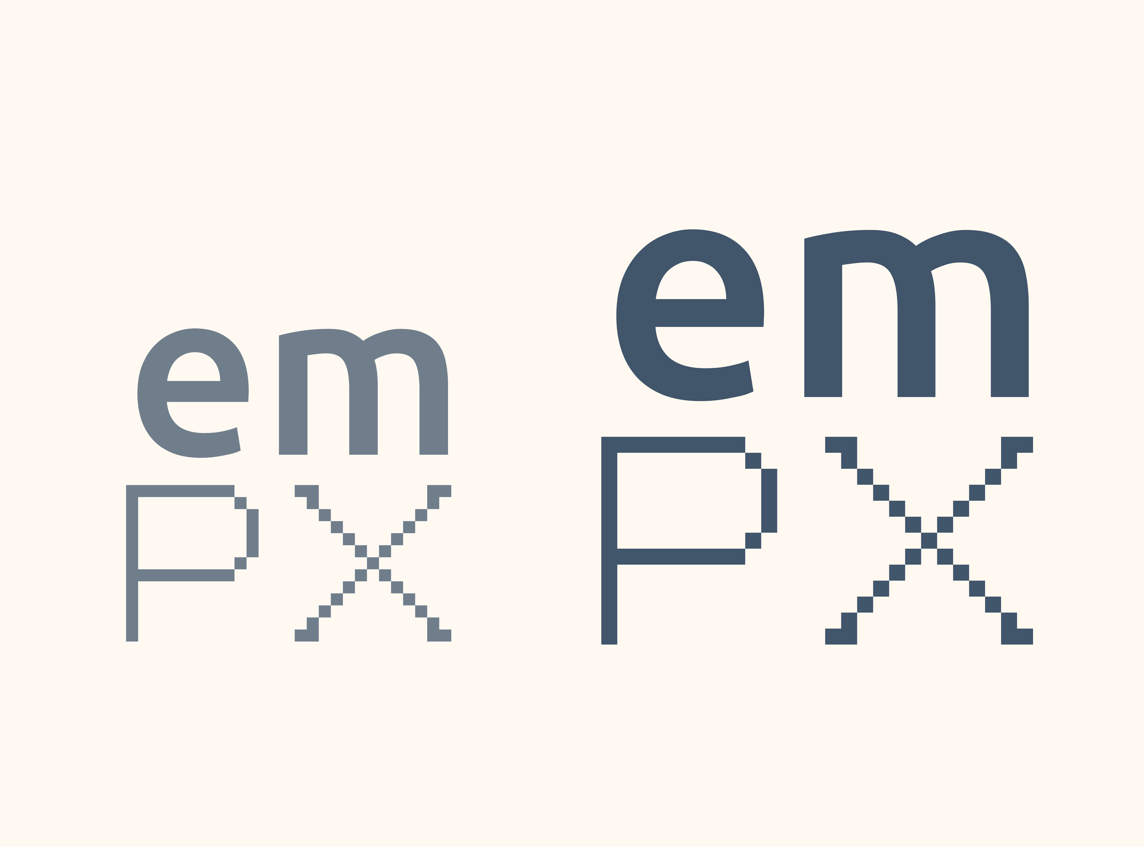
Many experienced developers use dynamic units over pixels because it provides all of the benefits of pixels while allowing views to easily scale to fit a user's display. To put it more succinctly, it helps to provide greater control over views.
Dynamic units function like vector images, in that you design for an aspect ratio (i.e. proportions) instead of a pixel resolution. You can then scale the design infinitely, which means that there's little need for media queries, breakpoints, pixel-pushing or creating differently-sized versions of the same image resources.
An aspect that is often forgotten in relation to scaling is iOS' commonly-used Display Zoom feature - which is enabled when users first set up their phone. With pixel-based layouts, views almost always break for users who have Display Zoom enabled. With dynamic units however, Display Zoom functions as intended. This means that many products, services and websites have views that break for a large portion of iOS users, unless developers have thought to implement a sensible scaling solution such as dynamic units.
Despite this, Material Design still insists on talking in terms of pixels. Instead of relying on dynamically-scaling views and elements that scale, stack- and wrap as needed, Material Design primarily builds views based on pixels, coordinates and grids. Not only does this increase the workload due to the fact that several variants of each view needs to be maintained, but it also causes issues when the user's browser window is of a different size than what the developers expected when they first built the views.
Material Design assumes that intelligent layout compositions are not part of projects that are built with Material Design, and as such developers are required to create their own solutions in order to dynamically scale views that use Material Design.
Another point that is often forgotten is that Material Design was originally created as a framework for harmonizing Google products. These products are known for having issues such as cluttered interfaces with low information density, an abundance of icons, a lack of descriptors and menus that contextually change- or disappear on a per-view basis to name a few examples.
Views built with Material Design often end up having buttons that look like links, poor information grouping through a lack of borders and containers, unusual visual indicators, unclear clickability and other such patterns that were invented for Google products - and which have now become staples of Material Design.
These are fundamental user experience issues that are apparent in the design system, through components that compromise on clarity for the purpose of taking up as little screen space as possible.
There are also functional color inconsistencies in Material Design views. In some cases a dedicated color is used to suggest clickability, while in other cases interactive elements are just plain white, black or gray.
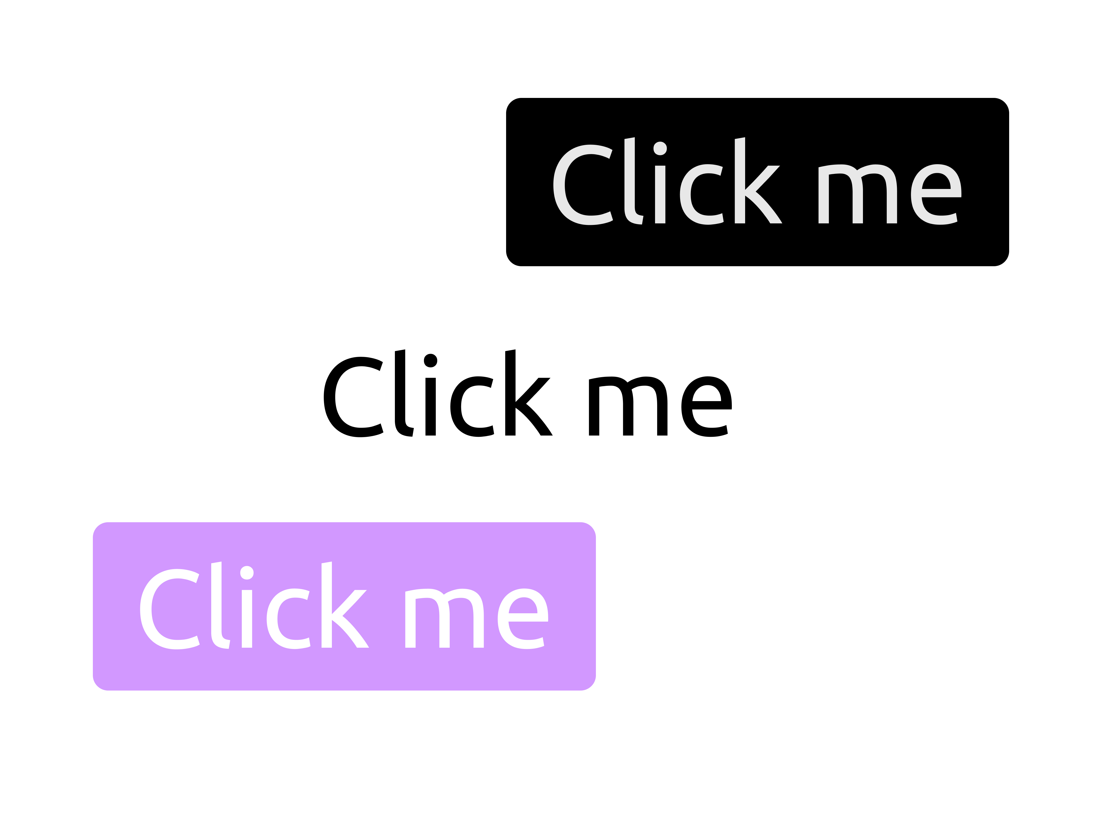
When users are looking at a view, they are trying to forage for information in regards to what will happen when they interact with an element - so that they don't have to click on it in order to figure out what it does. When a view has low discoverability - i.e. when it's vague about what will happen when something is clicked - then it increases the interaction cost for the user as they must experiment with the view in order to figure out how to get to their intended destination or how to achieve their intended goal.
The ironic thing is that by Material Design becoming more popular, it's attempting to establish a standard which in turn is a good thing for the user experience. However, the design system itself has a breadth of UX challenges which range from minor to significant. The question is whether Material Design is recognizable enough to offer an upside to UX, and if it does provide an upside it's important to try to determine whether the users' familiarity with Material Design outweighs its suboptimal design choices.
Conclusion
So what's the solution? Well, it depends on organizational needs. Ultimately it’s fine to use Material if an organization benefits from it, but at the same time it's good to be aware of the compromises that are being made as far as UX goes. A company that is UX-first probably shouldn’t use Material Design unless they're unusually proficient at bending the design system to their will.
The one thing that might be good to avoid though, is deciding to adopt Material Design solely because Google is perceived as a design authority. For anyone who doubts that a company as big as Google could be making fundamental mistakes (even after reading this article), consider the fact that they used bizarre brain teasers as part of their recruiting process in order to try to predict culture fit. It took them several years to realize that it was a waste of time - much like how they made counter-intuitive and unconventional design choices for Material Design only to invalidate it several years down the line through user research.
Some might consider whimsical experiments and strange design chocies to be an insignificant problem, but when other companies follow Google's example by adopting their tools and workflows, it might end up costing them candidates, customers or users.
If you take away nothing else from this article, then consider these points:
- Users crave consistency and predictability. When you violate established norms, users are confused and frustrated.
- When multiple elements compete for the user's attention, it increases their mental load. There needs to be a logical hierarchy between visuals in order to help users understand where to focus.
- Your visual brand profile should ideally be congruent with your product.
- Users tend to perceive good-looking layouts as more user-friendly.
And perhaps most importantly: remember that just because Google or another FAANG company does something, you don't have to follow suit. Choosing a tech stack with no consideration for how it will impact UX is likely to create a poor experience for the end-user. A good developer experience is not the same as a good user experience, so it might be worth making an assessment of the pros and cons of your tech stack from a UX perspective - and to try to include UX professionals in that discussion.
After all, collaboration between UX- and engineering is in itself an intrinsically positive thing, and should be done as early and often as possible.
Share this story
Did you like this story?
I write these articles in order to try to provide inspiration, insights and perspectives for UX practictioners and non-UX practictioners alike. If you think that this article was of value to you, feel free to share it with others.